Lamprey Brothers was a well known and established fuel delivery company on the north eastern seaboard of the US. Run by the same family since 1923, by 2010 it had lost focus, with declining customer numbers and an increasingly poor service record, and was sold.


The new owners quickly recognised that the company needed to re-establish its good name in the community, to turnaround negative customer feedback, and revitalise the brand.

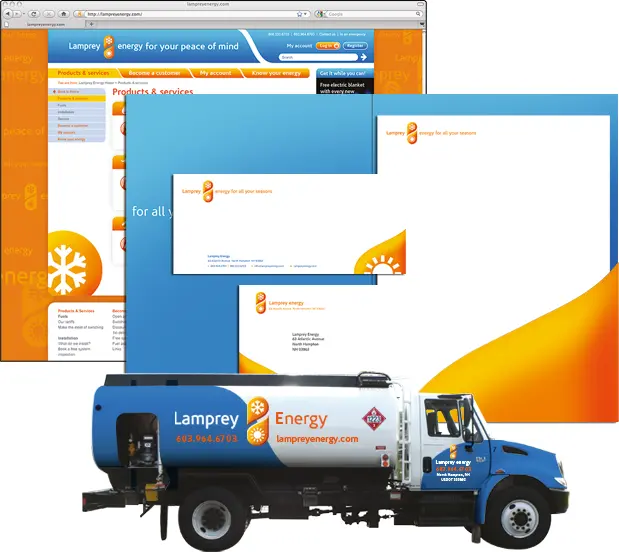
We worked with the owners to evaluate perceptions of the company amongst all its stakeholder groups, including staff, industry experts, suppliers, and competitors. We then developed a new positioning for the company, defining its brand and re-energising its offer. The name was updated from Lamprey Brothers to Lamprey Energy – capitalising on existing equity while denoting a new era – and the way the company looked, sounded, and communicated was transformed.

Guy Marshall President and Owner