Founded in 1994 as an organic milk supplier, by 2017 Omsco had broadened its scope to become the largest organic dairy cooperative in the UK, selling a range of dairy products not only in the UK but also in the US, Europe, China and Australasia. During that period, its operating environment changed significantly, with increased competition in the organic sector and a growing consumer interest in animal health and well-being.
To meet these challenges and protect its leadership position, Omsco revised its Vision, placing a greater emphasis on innovation and international growth.
Our brief was to evaluate and hone the organisation’s brand and communications approach in line with this new Vision.
A short but intense research programme confirmed that the current brand approach was too narrow – directed towards milk supply rather than the organisation’s wider dairy offer and giving insufficient emphasis to Omsco’s innovative approach to product and service development.
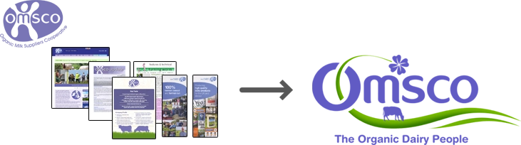
Additionally, our research unveiled weaknesses in Omsco’s brand narrative and visual identity. Rather than underpinning Omsco’s innovative and contemporary Vision, they were promoting an image of the organisation that was old-fashioned and narrow.
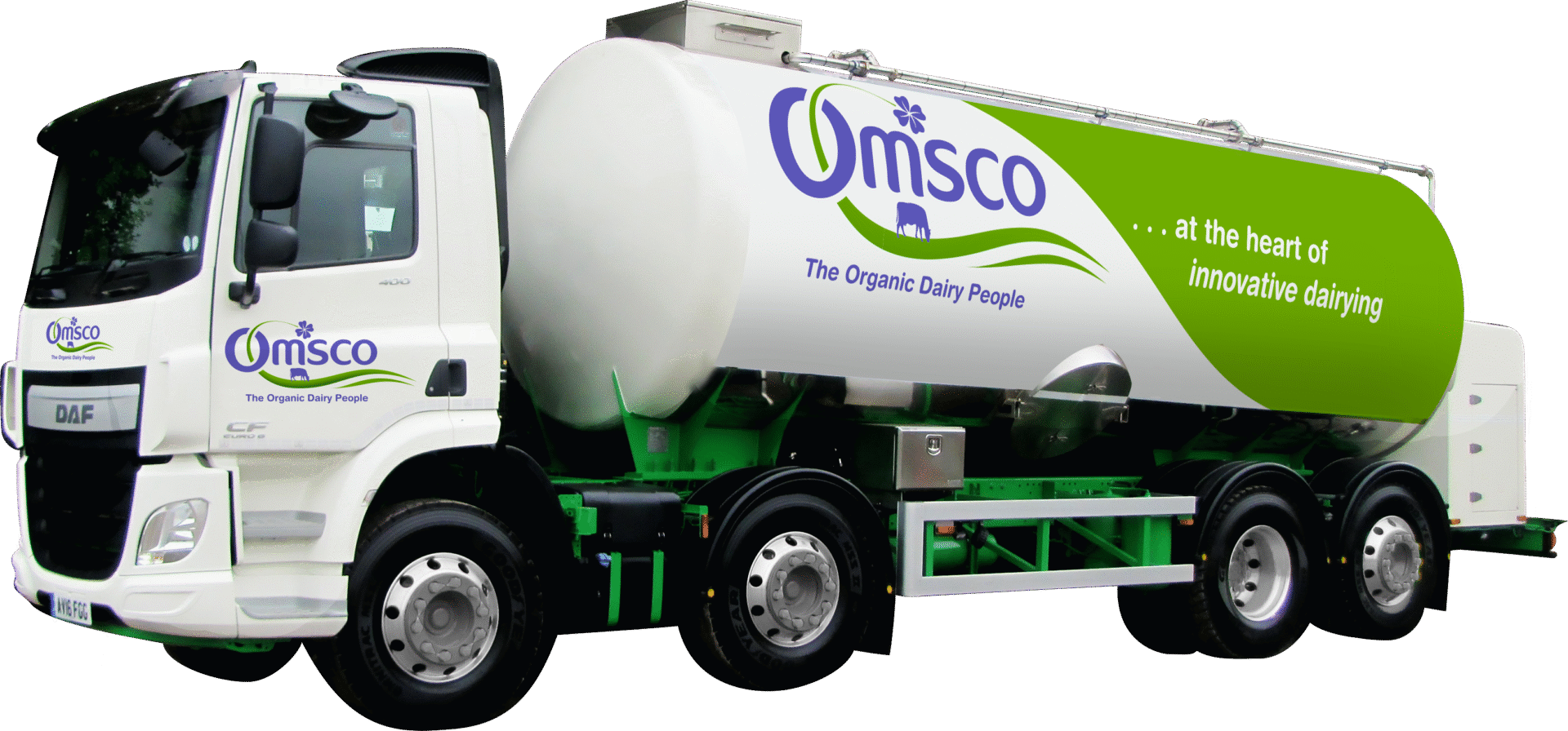
Building on these findings, we updated the brand definition, developing a new proposition and strapline ‘…at the heart of innovative dairying’ and a new integrated strapline ‘Omsco – The Organic Dairy People’. These new brand elements place greater emphasis on innovation, expertise and dairy, reflecting the organisation’s move away from simple milk supplier.
We downplayed the use of the term ‘cooperative’, focusing instead on the more contemporary terms ‘working together’ and ‘partnership’, which better reflect the symbiotic relationship of Omsco and its farmer members. We also modernised the name – removing the retrospective acronym OMSCO (Organic Milk Supply Cooperative) and replacing it with the simple name Omsco – giving the organisation the freedom to capitalise on the existing equity in its name whilst allowing it to broaden its meaning.
Having redefined the brand, we addressed the visual identity. The milk splash logo was beginning to show its age and the organisation needed a newer, more contemporary identity reflecting the company’s global credentials and new positioning.
Continuity was maintained by using the same typeface and the colour purple in the new logotype which gave greater emphasis to the natural environment. The key elements are the rolling pasture line, the grazing cow silhouette and the clover leaf – natural, real, pure, organic.

Deliverables
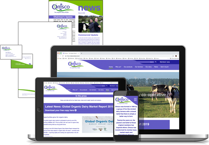
A comprehensive suite of internal and external communication tools including:
- Stationery, posters, brochures, banners
- Materials for launch conference
- Writing, designing and producing a short brand film
- New brand identity applied to key communications tools eg. letterhead, banners, presentations, conference materials etc
- Website (design and copy-writing).